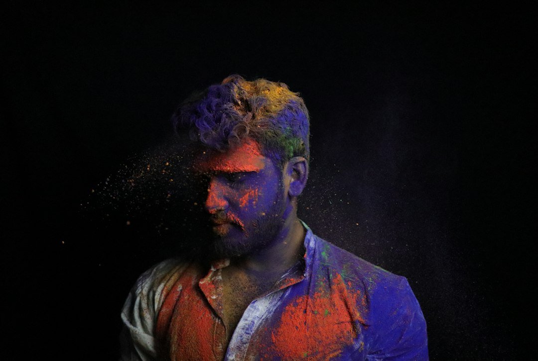
A tack-sharp subject can still look lifeless when the background is a murky, uniform brown. Even a perfectly exposed frame may feel flat if the backdrop lacks color variation, and the problem often shows up in portraits shot in dim interiors, wooded settings, or under mixed lighting. Fortunately, Adobe Lightroom offers a targeted way to address this without moving the image into a pixel editor.
Why Backgrounds Go Flat
Many photographers focus on subject exposure, skin tones, and sharpness, then overlook the tonal relationships around the main element. When a background contains only a narrow band of related hues, the eye has little to explore, and the image reads as one-dimensional. Shooting at a wide aperture can soften the backdrop further, but blur alone does not create visual interest. What the background often needs is a richer distribution of color.
Meet the Point Color Tool
Lightroom’s Point Color tool, found within the Color Mixer panel, lets you sample a specific hue directly from the photograph and then adjust the colors surrounding it. Rather than applying a global shift that alters the entire frame, you can isolate a region, such as a wall, foliage, or a muddy patch of ground, and modify only that portion. This precision makes it a practical alternative to masking for many common corrections.
The Variance Slider Explained
The key control for this job is Variance. It determines how wide a net the tool casts around your sampled color. Pulling the slider toward higher values widens the range, so the adjustment reaches a broader set of related tones and the background gains more color diversity. Moving it lower narrows the selection, keeping changes tight to a specific shade. In practice, a background that is uniformly brown can be opened up by increasing Variance, which allows subtle shifts in hue and saturation to appear across the wash of tones rather than in a single flat block.
A Practical Workflow
Start by selecting the Point Color tool and clicking on a representative area of the background. Next, choose the Saturation or Hue range you want to influence. Adjust Variance until the affected area captures the tonal range you want to work with, then nudge the Hue, Saturation, and Luminance values in small increments. Keep an eye on the subject’s edges and skin tones. If the adjustment begins to spill into areas you want to keep neutral, narrow the Variance slightly or refine your sample point. Working in small steps usually produces the most natural result.
Keeping Results Believable
As with any local color adjustment, restraint is important. Overly saturated backgrounds can compete with the subject and draw attention away from the story of the image. Viewing the edit at 100 percent and at a smaller preview size helps confirm that the change looks convincing across viewing conditions. Comparing before and after versions can also reveal whether the background now supports the subject or distracts from it.
Why It Matters for Working Photographers
For editorial, commercial, and portrait work, efficiency matters as much as quality. A tool that delivers a meaningful improvement in a few adjustments can save significant time across a large shoot, especially when hundreds of frames need consistent treatment. Because the Point Color workflow stays within Lightroom, it fits naturally into a catalog-based process without the round trip to Photoshop that many photographers prefer to avoid. For anyone who regularly finds their backgrounds looking muddy, the Variance slider is a compact tool worth learning.