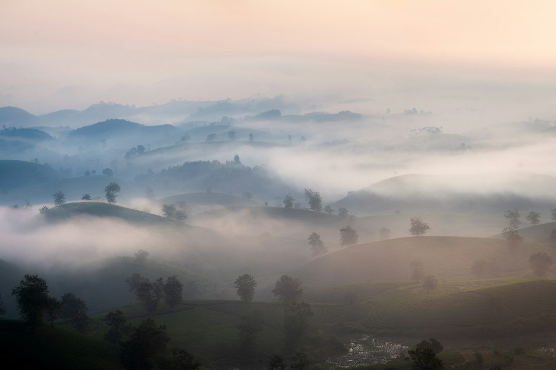
A landscape can be tack-sharp, correctly exposed, and thoughtfully composed, and still come out of the editing suite looking like a flat print pinned to a wall. The problem is rarely the capture itself. Depth in a two-dimensional image is built from visual cues the brain reads almost instantly: where light pools and where it falls off, how contrast softens as subjects recede, and how warm and cool tones sit against one another. The good news is that most of these cues can be strengthened after the shutter closes.
Below, we look at the kinds of adjustments that help a landscape feel like a place you could walk into, rather than a surface you simply look at.
Guide the Eye with Selective Light
Global exposure sliders treat the whole frame as one piece, which is why they often flatten a scene. Local adjustments change that. Using masks, brushes, or gradient tools, you can lift exposure on a foreground rock or a patch of wildflowers and let the midground settle slightly darker. That gentle tonal stepping mimics how natural light behaves across a real landscape and gives the eye a clear route from front to back. Dodging and burning in moderation works especially well here, as long as the transitions stay soft enough that nothing looks painted on.
Restore Atmospheric Perspective
Distant mountains look paler and bluer than nearby hills because air scatters light and reduces contrast over distance. Photographers call this atmospheric perspective, and it is one of the strongest depth cues available. When a scene looks muddy in the far distance, a targeted reduction in haze, combined with a slight lift in blacks and a controlled drop in midtone contrast on the furthest ridges, can restore that separation. Be cautious with dehaze sliders applied globally, since they can introduce halos along edges and make skies look harsh. A local approach almost always looks more convincing.
Balance Warm and Cool Tones Deliberately
Color temperature is a powerful tool for spatial depth. Warm tones, such as amber grasses or sunlit rock faces, tend to advance toward the viewer, while cool tones like blue shadows and misty valleys recede. Split toning lets you place warmer highlights in the foreground and cooler shadows in the background, reinforcing that sense of layers without overt stylization. Selective color adjustments can accomplish something similar by nudging the saturation of greens and blues by distance. The key is restraint. A few points of shift usually do more than a dramatic filter, and the image should still look like the scene you stood in.
Sharpen Micro-Contrast in the Right Places
Clarity and texture sliders can add the impression of depth by enhancing fine detail, but applied evenly they tend to flatten as much as they lift. A better approach is to apply modest local contrast to foreground elements such as stones, tree bark, or sand ripples, where texture naturally reads as close. Leave distant forms smoother. This contrast in detail density, sometimes called the gradient of sharpness, tells the viewer which elements sit closest to the lens. Pair it with careful noise reduction in the sky and shadows so the added texture does not turn into distracting grain.
Putting It Together
None of these techniques works in isolation. The strongest landscape edits layer several cues at once: a bright foreground anchor, softened distant contrast, a subtle warm-cool split, and texture that fades with distance. Work in stages, compare against the original frequently, and step away from the screen before making final decisions, since fatigue often leads to overprocessing. When the edit is finished, the image should feel open and three-dimensional, inviting the viewer to explore rather than merely observe.