Transform Your Images Through Strategic Color Grading
The distinction between a photograph that captivates viewers and one that struggles to engage often comes down to a single factor: color grading. Within Adobe Lightroom’s comprehensive suite of editing tools, the color grading panel stands as perhaps the most transformative feature available to photographers—yet it remains underutilized or misapplied by many practitioners in the field.
Color grading extends far beyond simple saturation adjustments or basic white balance corrections. When executed strategically, it becomes a sophisticated storytelling mechanism that can dramatically enhance mood, draw viewer attention to specific compositional elements, and establish a consistent visual signature across your portfolio. The challenge lies not in accessing these tools, but in understanding how to deploy them effectively.
Understanding Complementary Color Theory
The foundation of professional color grading rests on complementary color relationships—hues positioned opposite one another on the color wheel. When paired together, complementary colors create natural contrast and visual harmony simultaneously. This principle, rooted in color theory, allows photographers to add dimensional depth without introducing jarring or unnatural appearance to their images.
In practical application, incorporating complementary tones into your shadows, midtones, and highlights creates visual sophistication that sophisticated viewers immediately recognize. Rather than applying uniform color casts across an entire image, targeted application to specific tonal ranges preserves realism while elevating the overall aesthetic impact.
Navigating Lightroom’s Color Grading Controls
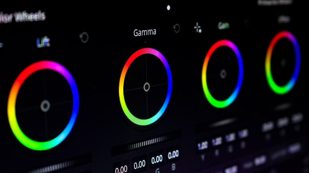
Lightroom’s color grading interface organizes adjustments across three distinct tonal zones: shadows, midtones, and highlights. This separation proves invaluable when implementing complementary color strategies. You might introduce warm, complementary undertones into shadow regions while simultaneously applying cool, contrasting hues to highlight areas, creating visual tension that feels intentional rather than accidental.
The split-toning approach, achieved through the color grading panel, allows photographers to establish warm-cool relationships throughout their tonal spectrum. This technique, favored by professional colorists and advanced photographers, requires patience and understanding but yields remarkably polished results that distinguish serious work from casual edits.
Common Mistakes and How to Avoid Them
Many photographers approach color grading with excessive aggression, applying saturated colors that overwhelm their subject matter. Subtlety typically proves far more effective than obvious manipulation. Secondary mistake involves ignoring the interrelationship between different tonal zones—adjustments should work harmoniously rather than fight against one another.
Professional editors recognize that the most compelling color grades often remain virtually invisible to casual observers, yet prove essential to the image’s overall impact. The goal involves enhancing, not replacing, the natural color information captured during shooting.
Developing Your Signature Style
Consistent color grading practices help establish recognizable visual branding throughout your photography. By developing systematic approaches to implementing complementary colors, you create cohesive portfolios that immediately communicate your aesthetic philosophy and technical competence to potential clients and followers.
Mastering Lightroom’s color grading functionality represents an investment in long-term creative development, positioning you among photographers who understand that exceptional images require thoughtful post-processing execution alongside strong in-camera technique.